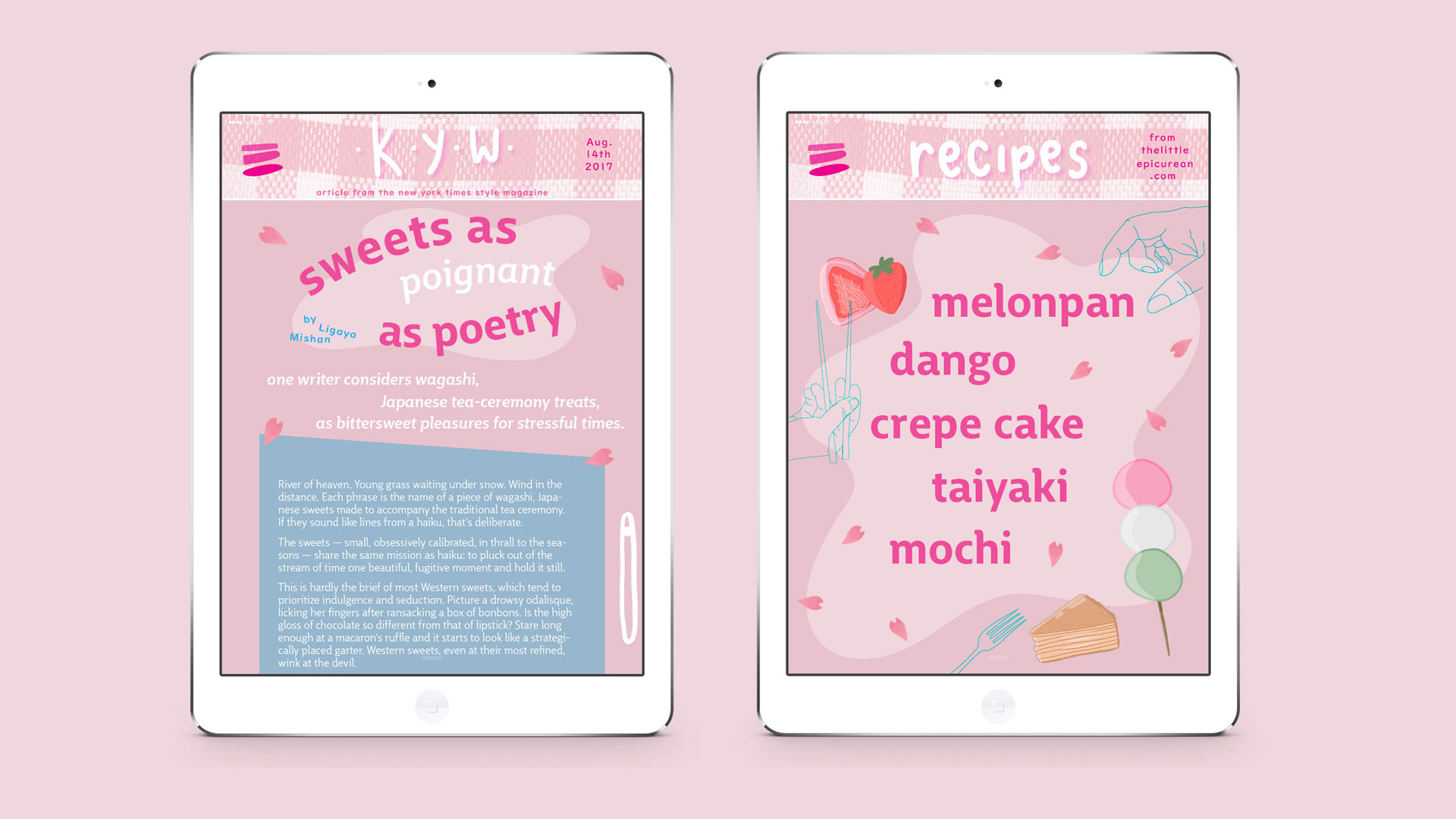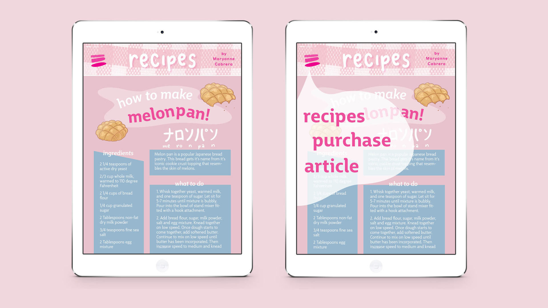
This digital zine has information about the traditions surrounding Wagashi, Japanese desserts, as well as a variety
of Wagashi recipes. I designed this zine in a way that is easy to understand and navigate. I also incorporated illustrations I drew to contribute to the “kawaii” aesthetic I feel resonates with the topic of Wagashi. The pastel
and playful color palette also help push the kawaii aesthetic forward. I designed a menu for the zine where
the user can easily move from one page to another.
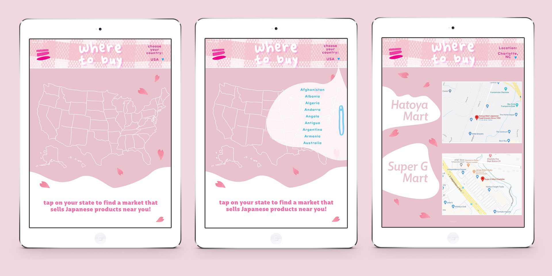
In addition to the article page and the recipe pages, there’s a page where the user can easily find Japanese markets in their area so they can buy their own Wagashi or ingredients to make Wagashi! I used a variety of typefaces, including a hand-drawn typeface. The typeface I drew is bubbly and lively, lending to the kawaii theme. As for the other typefaces, I chose something both whimsical and legible. Despite them not being hand-drawn, they’re still humanistic and exciting!