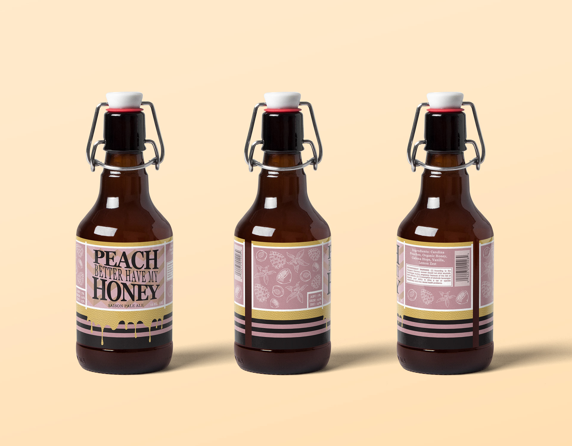
I enjoy combining multiple artistic elements and this is an example of that! My goal here is to create a clear connection between the label and the flavor of the pale ale. I did this through the use of colors representative
of the ingredients within the pale ale. I also utilized texture through the use of illustration by incorporating small, detailed drawings I did of the different ingredients. I love including my drawings within my packaging designs
to bring in organic and humanistic elements, relating more to the consumer.
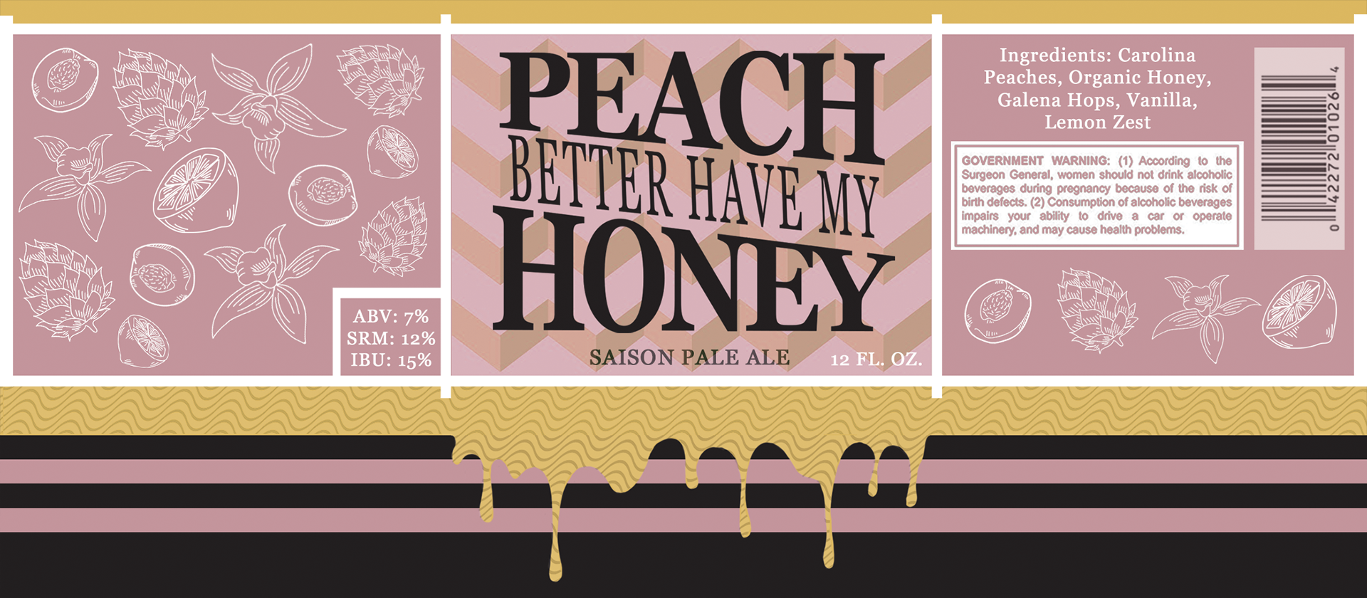